
Feb 08, 2022
We’ve all been there - stuck in the meeting where slide after slide of data is presented as anaemic bar charts, graphs and ‘animated numbers’. No narrative. No story. No impact.
But data doesn’t have to be boring! Used in the right way, data can tell a compelling and captivating narrative. From interactive interfaces to videos and animations, a data story will often combine things like maps, images, graphs, statistics, text, video and audio. The aim is to bring data to life in a meaningful way for your audience, making it engaging, persuasive and memorable.
This is more than just dashboards and infographics. This is the evolution of data storytelling.

In 2021 the world created 2.5 quintillion bytes of data every day. (There are 18 zeros in a quintillion. Just FYI.) With so much data we need tools to help us produce data stories - breaking down the data barriers to storytelling. No-code is one of those solutions. Platforms like Shorthand and Juicebox are designed to be easy to use without specialist technical skills.
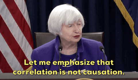
Now, here’s the note of caution (that anyone who attended our session on disinformation with the BBC editor of disinformation, Rebecca Skippage, and/or who listens to the More or Less podcast will be all too familiar with) - you can cut data to tell just about ANY story you want. Correlation is NOT causation.
In the post-truth era you have a vital role to play in using data to tell powerful, engaging and accurate narratives. Combine that with the findings that “emotion has overtaken reason in driving brand choice” and it becomes even more urgent to find skilful ways to bring to life the stories that data reveals. Data stories can translate numbers into impact and apathy into action.
You are sitting on a goldmine. Now, let’s explore how to use it.

Evolving over the past decade, data journalism is a contemporary form of journalism, described by the Bureau of Investigative Journalism as, “Journalism that uses technology to access, analyse and find stories in data and then tell the stories of the people the data represents.” The Guardian describes it as “Numbers you can tell stories with.”
News sources are telling data stories in all kinds of ways, covering topics from elections to the climate crisis. Sky News originally created Brexit By Numbers to address the confusion resulting from claims made during the Brexit debate. Now it continues to analyse how the UK has changed since voting for Brexit. Labour Day, created by New Zealand news site Stuff, shows a vote-by-vote analysis of New Zealand’s historic shift to the political left.
The BBC’s When your capital is sinking draws on a range of data sources to show the impact of plans to move Indonesia’s capital away from the sinking city of Jakarta. In What Africa Will Look Like In 100 Years, The Telegraph envisions the consequences of rapid population growth across Africa over the next century.
Data stories don’t always have to be visual. More or Less with Tim Harford on Radio 4 “explains - and sometimes debunks - the numbers and statistics used in political debate, the news and everyday life”. Episodes explore everything from ‘Life under lockdown in numbers’ to ‘Are natural disasters on the rise?’.

Data stories are playing an important role in our understanding and processing of the impact of the COVID-19 pandemic. National Geographic’s Visualising 500,000 deaths from COVID-19 in the U.S. combines drawings with numbers to help us conceptualise the scale of these deaths, where a succession of raw statistics alone can become meaningless.
Imperial College’s COVID-19: six months on the frontline tells the story of the defining moments of the first six months of the pandemic, through a timeline supported by text, photos, audio, quotes and statistics. The results are emotive and powerful. Radio NZ mixes a timeline format with video, graphs, maps and photos to show how the coronavirus started, spread and stalled life in New Zealand, in its COVID-19 pandemic timeline.

Charities are making great use of data stories to demonstrate their case for support with real power. In the Marine Stewardship Council’s How my dad fishes for the future, we hear a personal narrative in the voice of a fisherman’s daughter that explores how we can end overfishing and make oceans more sustainable.
We’re also seeing charities using data storytelling to communicate their impact to supporters. Oxfam Ireland’s impact report uses data, maps, infographics and photos to tell the story of the charity’s mission, work and results during a year. Examining Inequality by The Bill & Melinda Gates Foundation uses interactive UI to zoom in on parts of the map, moving between the big picture and the stories of individuals and communities, to bring the data to life.
Data stories can give voice to social issues with stark simplicity. Periscopic’s US gun deaths synthesises data visualisation with emotive copy to drive home the devastation caused by gun crime in the States. In contrast, data storytelling can be used to forge relationships and promote good feelings too. Harry Specter’s chocolates sends an email after each purchase with ‘Your personal social impact report’, using data and photos to show the direct correlation between your contribution and its results. A data story in micro form.
Data doesn’t speak for itself, or the data journalist would not be needed. Instead it must be interpreted. This is the process of selecting and obtaining the relevant data, finding the interesting facts or patterns, putting them in context, and explaining what they mean. Think carefully about the data sets you’re using and conclusions you’re drawing. Challenge internal bias. And remember… correlation doesn’t mean causation.
Data stories don’t have to be heavy or serious. Why do cats and dogs? offers a humorous visual exploration to help us better understand cats and dogs, while Happy Data gives “hopeful views of the world through data and drawings.”
How could you develop your data storytelling skills? It doesn’t necessarily have to involve paying for training or a workshop. Harvard Business School explores data narrative here and Shorthand offers a free webinar, and a helpful guide.